TAKERS: The Visual Effects Workflow for a Short Horror Film
An essay detailing the intensive visual effects workflow on my short film Takers, from the pre-production phase all the way through post-production and completion of the film.
The Short Film
Here’s the completed film below, which serves as a great reference and context for all of the discussion to follow:
What is TAKERS?
TAKERS is a short psychological horror film that is also a proof of concept for a larger feature film idea.
The story follows Kara Thompson, an incredibly anxious college student who is violently confronted by an evil supernatural Plague Doctor named The Doctor, that tortures her with his superhuman abilities and forces her to come face to face with her own greatest fears.
Takers is deeply inspired by my favorite psychological horror films such as The Ring, A Nightmare on Elm Street, Hellraiser, A Cure for Wellness & Suspiria (2018). I was also fascinated by the idea of bringing in a dynamic and kinetic sense of action choreography and stunts from films like The Matrix or John Wick into the intense horror mixture to create a concoction of horrific intensity, that was also fun and thrilling to watch. I loved the idea of creating a central inhuman antagonist, that was very much a mixture of practical and visual effects to create the look of the character; inspired by the famous franchise antagonists such as Freddy Krueger in Nightmare on Elm Street and Pinhead the cenobite in the Hellraiser franchise.
To be honest, I also wrote this as a challenge to myself to learn how to direct something with a large number of Visual Effects (or VFX) shots and stunts involved. To add to the complexity of my director’s arsenal, I wanted to learn how to work with department heads such as a Stunt Coordinator and a Visual Effects Supervisor, as well as a Visual Effects Artist.
It was also an exceptional learning experience from the producing side, as I co-produced the short as well. Learning to coordinate and orchestrate these complex additions to the shoot and the budget costs were invaluable to my filmmaking career.
I wrote, directed, co-edited, co-produced & co-color graded this film and it was a wonderful experience but also presented an array of intricate challenges, predominantly in the post-production and visual effects phase.
Why a Case Study?
For the sake of this discussion, I plan to focus predominantly on the Visual Effects workflow and the post-production phase of the short film. Certain elements were first conceived of in the early development and pre-production stages, but the vast majority of the pipeline and workflow occurred during Post-Production.
Since I had never really had any experience with involved visual effects or stunts in a project, I learned so much and also which pitfalls to avoid for next time. This case study is meant for filmmakers dabbling with VFX for the first time or are considering incorporating it into an upcoming script or project and want to know more about how these projects come together.
Pre-Production
Creating an Antagonist
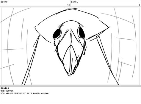
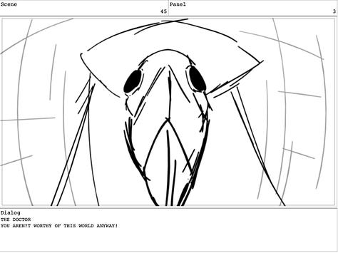
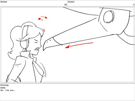
The very first image that popped into my brain so vividly was the shot of the Plague Doctor’s beak mask extending outward toward the viewer, in a three dimensional effect that resembled a sadistic Pinocchio nose growing.
Before I ever wrote the script, this image was burned into my brain and I immediately determined that I’d figure out how to make the shot happen within a film.
I eventually brainstormed the idea over a series of weeks and ultimately fleshed out the Doctor character and Kara and then wrote out the first draft of the script, which essentially functioned as just a standalone short scene for what encapsulated a much larger story and world.
The scene was meant to be a proof of concept and also capture the initial meeting and violent confrontation between Kara and The Doctor. My goal was to introduce the audience to The Doctor, in hopes that he would be compelling and terrifying enough of an antagonist that he could lead an entire franchise and keep people coming back for more, much in the way of a Michael Myers in Halloween or Freddy from Nightmare on Elm Street.
I also wanted the scene to be riveting, action packed and thrilling enough to warrant an interest in expanding it into the full feature film version and create a larger audience demand for the story.
Creating the Look of The Doctor - The Philosophy & Practicality of a Villain
I had always loved the eerie and ominous look of the Plague Doctor costume from the Middle Ages ever since I first learned about the Black Plague in school.
It was at once eerie, but also faceless. It was a white beacon, amongst a sea of black robes and was essentially the harbinger of death, when a Doctor would arrive in a plague ravaged town in Europe at the height of the Black Plague.
Not only was it a metaphor for death, perfect for a horror film, but also created a very practical and realistic means of having a character exist on screen that didn't necessarily need Makeup or VFX on the face (which is typically what always destroys an illusion for on-screen effects on a character). It allowed an actor in costume to be shot practically, and this also allowed the actor playing Kara to actually act against another performer in the scene and have an eye-line of where to look (another pitfall that destroys the illusion when acting against a fully CG character.)
I also always knew that by making the antagonist a supernatural force, he could pull off superhuman abilities and this is what led to the involvement of stunts into the mix.
One of the major benefits of having written and directed a handful of short films and produced and edited them as well, is that it pushed me to always start thinking like a producer. Even in the writing and idea phase, I am always thinking about how we would be able to realistically achieve the look or effect of what’s in my head.
Some might disagree with this sentiment and argue that this kills the purely creative headspace one should be in when writing, but as a writer who also directs independent films, I find it much more helpful to think this way, so that I can be realistic and actually achieve the result desired based off the often small budgets and time constraints and crew that I am working with.
It also allows me to bring fully formed ideas to the table already once I start answering questions from my cinematographer, production designer, other producers, VFX supervisor and artists, etc. The quicker you are clear as the director, the quicker you can convey to your team and the quicker they can do their jobs and ask you the right questions and get ahead of the curve. After all, time is money.
The Visual Inspiration for the Doctor
After having settled on a Plague Doctor as the main antagonist, the next step was to conduct research and visual inspiration.
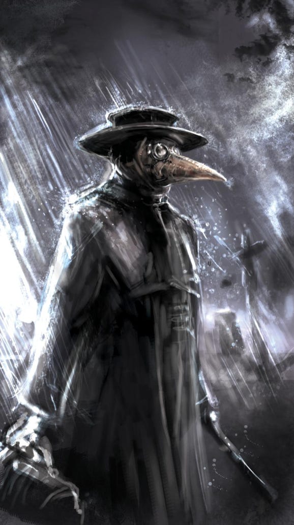
I utilized Tumblr, Google, Pinterest and DeviantArt.com to browse hundreds of Plague Doctor images and concept art, paintings, and sketches, etc. Interestingly enough, there is not a single real photograph of a Plague Doctor from the time, as photography hadn’t been invented by a couple hundred years. Therefore, all we have is artistic interpretations and hand-made depictions from then and now. In many ways, I think this creates and even more interesting interpretation and that nobody can fully point to as an “incorrect” for how anyone else depicts it on screen.
Early on, there were a few key pieces of art, that you can see below, that really solidified the dark and nightmare-ish tone and comic book visual style of the Doctor that ended up informing the rest of the design phase.
I always need clear photos or visuals to help guide me as I write, and these images were perpetually pinned to my desktop on either side of my Final Draft script file.
Initial Scope of Work and Production
After the script was written I called up a new friend I had met recently and who was quickly becoming one of my most reliable and amazing collaborators on my films. This collaborator, who I’ll call “Supe”, worked as a Visual Effects coordinator at the time for a Visual Effects studio, and had a lot of experience sourcing VFX artists and managing workflows and helping see films with multiple VFX shots and artists to completion. Supe’s knowledge of the process and requirements for what was needed on set proved invaluable, as we started mapping out the logistics of the shoot and he joined the film as our VFX Supervisor.
At the time, the initial scope of work in my brain only required around 4 or 5 VFX shots, one of which was that vivid “Pinocchio” beak extension shot. I believe the others at the time involved “paint-outs” (removing rigs or cables, etc from the shot), The Doctor “teleporting” across the frame, and an alternate angle or two of the beak extension from the side.
I figured the initial 4-5 shots were a doable place to start, from a cost and logistics standpoint, as someone who had no idea what the heck I was doing with VFX. Little did I know that later that scope of work would septuple from 5 to around 35 VFX shots!
Many of the later shot additions added to the scope of work were late creative decisions I made way after we had shot the short. These ended up being things like angle augmentations or small fixes or post camera shake adjustments to boost the intensity.
I should note that the “fix it in post” adage is typically never a great way to plan for VFX. Planning it out clearly in the early stages is much more ideal, but this very lesson ended up being one of the most valuable I took away from the project.
Supe also agreed that the initial scope was doable and suggested that once their were storyboards and a detailed breakdown shot sheet (which I’ll detail later on), he could get a more accurate cost and timing estimate of the work needed.
Storyboards and Stunt Coordinator
Once the script was ready, I contacted a storyboard artist named Todd Hoppmeyer, that I had worked on a Netflix Animated series with, since I had spent a few years in the animation industry in production.
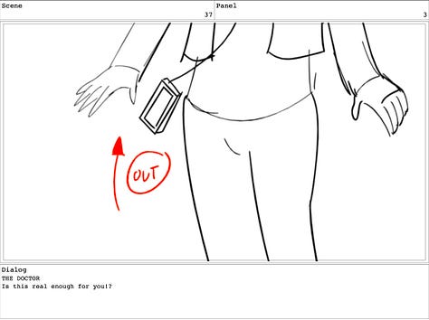
Todd and I jumped on a call after he had read the script and we agreed to a rate. I talked him through my initial ideas of certain angles and a few very specific shots I needed in the script. The three important shots I knew we needed boarded were:
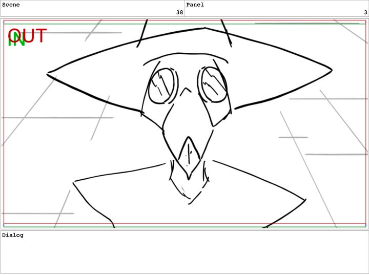
The Pinocchio Beak extension shot.
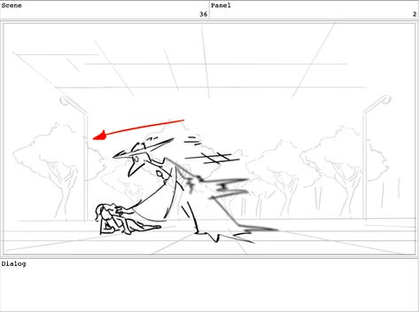
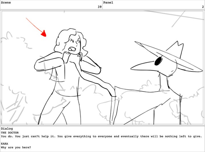
The Doctor choking Kara and lifting her off her feet.
The Doctor raising his hand to levitate Kara high off the ground (in hindsight I realized the nod to Star Wars with “the force”, but admit this wasn’t intentional at the time; most likely subconscious.)
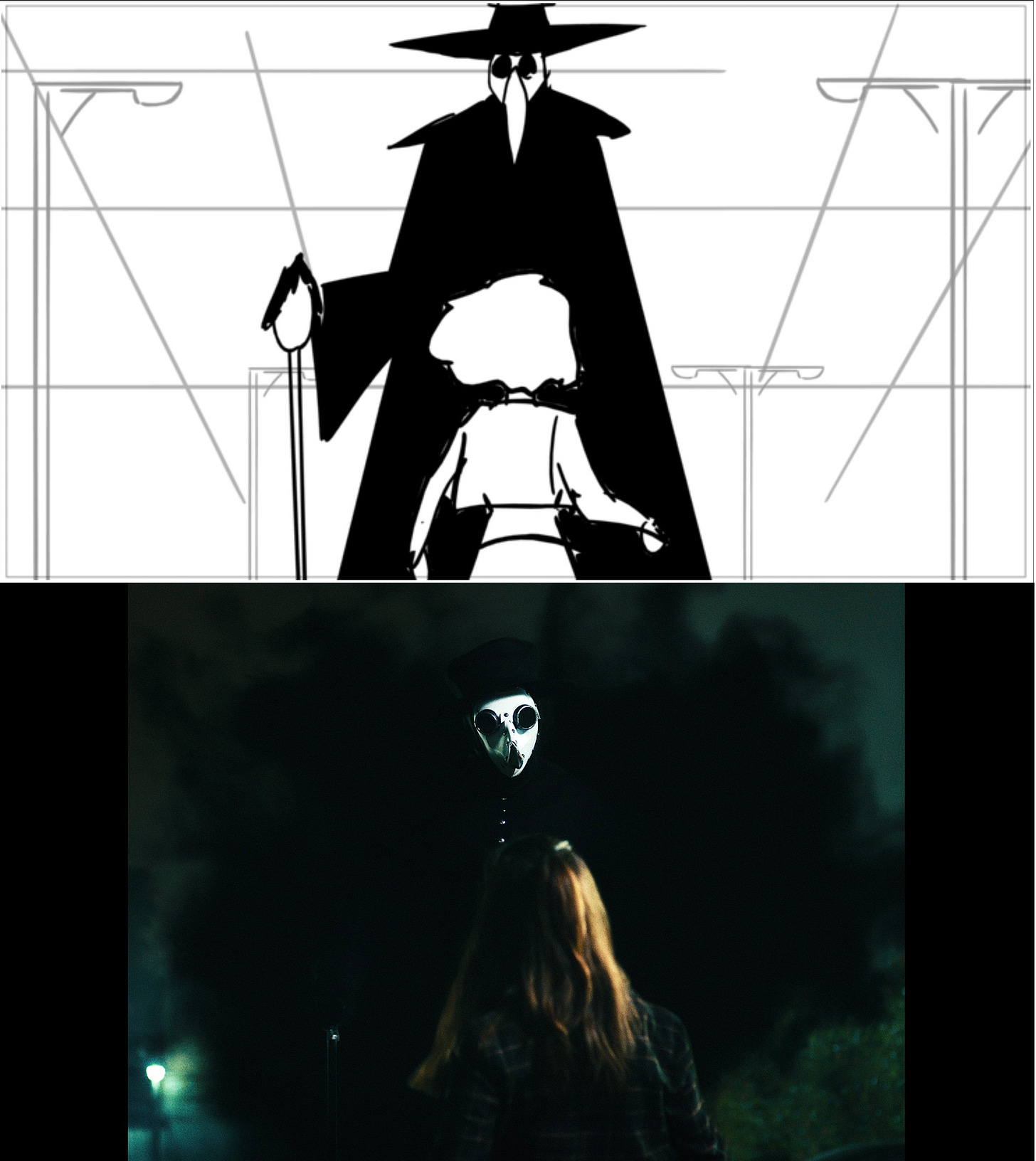
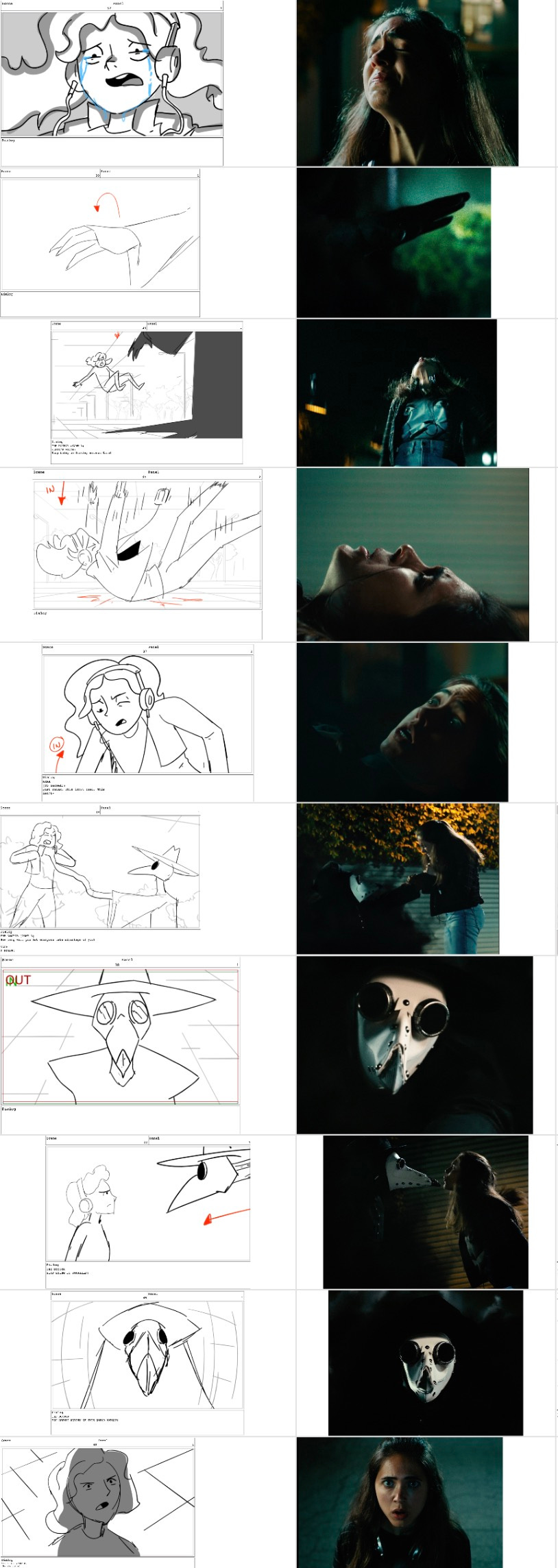
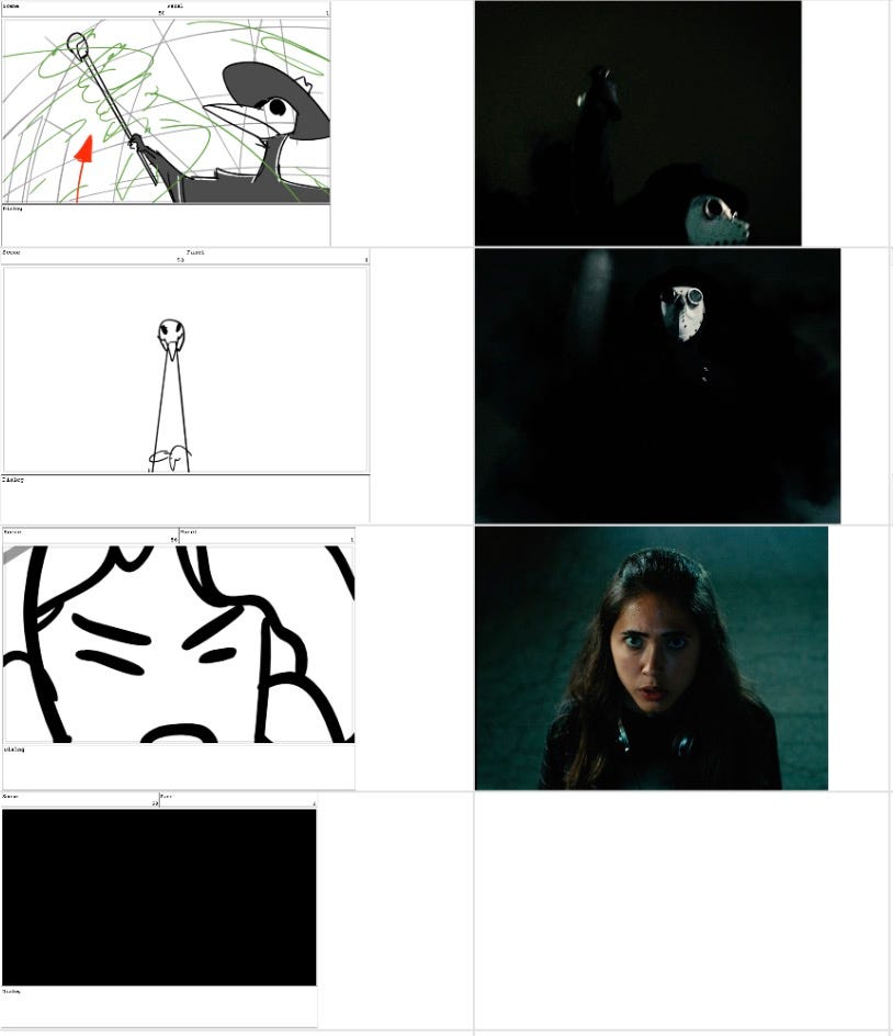
You can check out a handful of those storyboarded shots below. For a full side by side of how virtually every shot from the actual film compared to its respective counterpart storyboard, take a look at the Footnotes Section at the very bottom of the article.
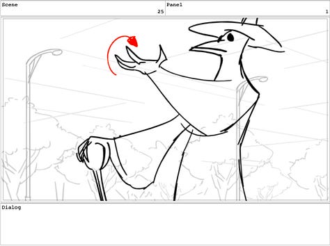
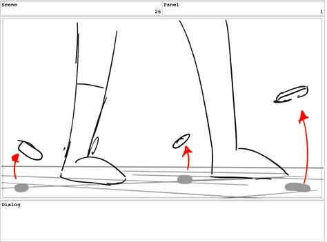
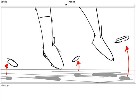
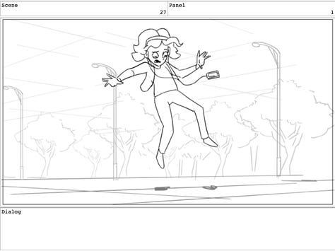
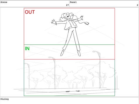
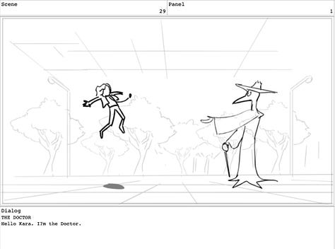

At this point in the development of the film, I knew I needed some producing help, so I enlisted two of my favorite producers and great friends at this point, Katie Anne Moy (KAM) and Willis McCord.
As a quick side note, Katie Anne and Willis had never worked together before or met and I selfishly brought them both on in the hopes that they would mesh well together and we could act as a powerhouse triumvirate to produce this and future projects together, and so far that has proven to be completely true.
After KAM and Willis jumped on board, we split up the producing workload, so I could focus some more on the creative and directorial elements of pre-production.
One of our next steps was to bring on a stunt coordinator for the “levitation” and “choking effects”. KAM had a contact of a stunt coordinator named Ian Eyre, that she had worked with before, so we contacted him via email and he expressed interest and we scheduled a call.
What was invaluable to have was the storyboards, since we were able to email the script and storyboards over to Ian preceding the call, so that he could get a visual for what the levitation and choking effects were supposed to look and feel like.
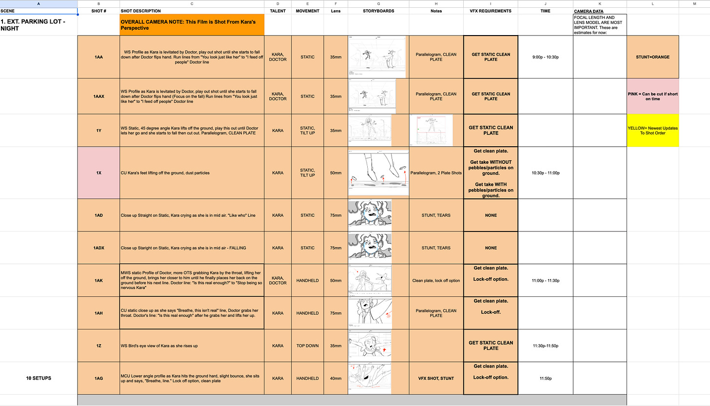
At this stage, I was also able to show the storyboards to Supe and to Martin Taube, our excellent cinematographer that we had brought on as well. Another benefit of having the storyboards is that it was an extremely clear and efficient tool for creating our shot list to communicate to Martin with. All I had to do was plug in each individual board into the shot thumbnail on the spreadsheet to communicate our angles.
This document proved invaluable since it eventually became a one size fits all doc that contained our visual shot information, slate number and letter info for the 2nd AC, VFX needs on set as well as the arrangement of the shots into shooting order so that it could also act as a schedule of each day’s shoot that Willis could oversee; doubling as our 1st Assistant Director in addition to producing.
The full document can be viewed HERE. And here’s a preview of it below:
As the shoot drew closer, KAM, Willis, Martin and myself eventually all got on a call with Ian the stunt coordinator and I outlined my vision for what stunts would be needed and how they should look. Ian suggested we utilize a stunt rig called a Parallelogram to do the levitation and the choking effects. He also offered to pick up and tow the rig to set for a slight additional cost and bring some crash pads for safety. Instead of constructing a truss and doing a harness pull for the effect, the Parallelogram offered a more cost-effective solution that required less people to set up, along with creating more of the specific creative effect of how I wanted Kara to be levitated. I wanted her to levitate up and at the apex of the rise, immediately freeze in place, with her arms and legs firmly held in place.
With the harness pull, the actor sometimes can still swing around after they are pulled up (like a pulley system), but with the parallelogram, it almost functions like a large see-saw, in which the actor straddles a pad at one end and then weight and someone else pushes down on the other end, raising the actor pretty high into the air.
Parallelogram Rig in action on our set taken from the raw footage below:
For a comparison, here’s the same shot from the final film with full VFX and color grading:
We all agreed that this would be the best solution and worked out to have Ian and the rig there for only one night to keep our costs down for the shoot. With our planning, it was looking to be a two night shoot over the course of a weekend with two overnight shoots back to back.
Looking back, as I write this article, it’s actually quite fun to see how much evolved throughout the process from specific angles or shots to certain dialogue that all changed by the time the film was complete. The most rewarding aspect is to be able to look back and observe how close the finished film is to the initial plan we made in the early daydreaming days.
On Set VFX Needs
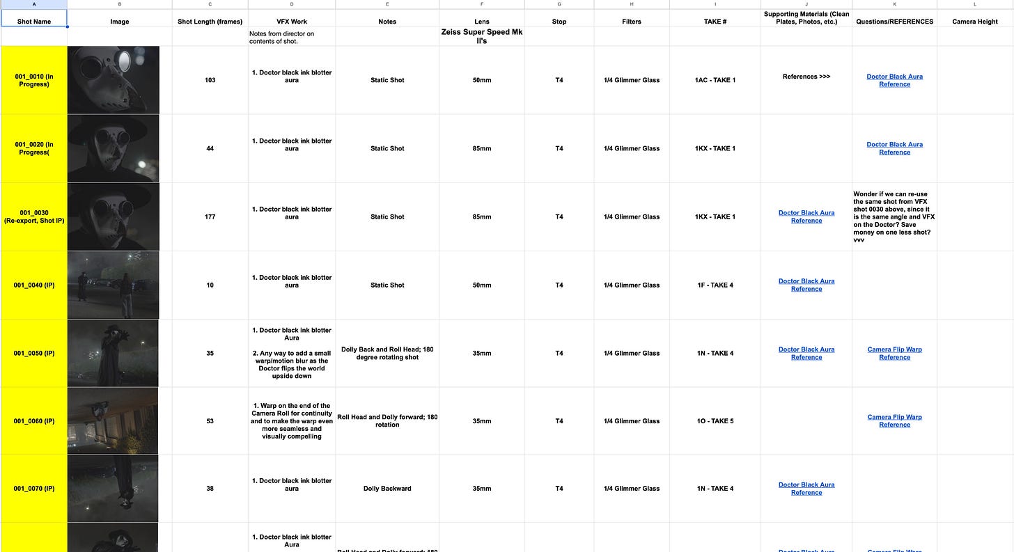
In the weeks approaching production, Supe provided me with a VFX Breakdown Sheet template, which essentially is a spreadsheet template in which you can fill out information such as the shot thumbnail, the length of shot in frames, notes about the VFX needs, lens focal length and any other pertinent info that is needed. This is done to get a sense of the scope of work and what needs are required for the purposes of getting a proper price quote and is sent out to VFX vendors to bid on the work.
At the onset, I had only filled out a small handful of shots since I initially thought it would be the 4-5 I mentioned above. Another interesting thing to note is that when we shot the film, I didn’t really plan for there to be black smoke emanating off the Doctor in every shot he appears in, as it currently is in the finished film. I had ideas about ways to enhance his appearance but we just went with the plan to shoot an actor in a black plague doctor costume and mask and then go from there.
Once I had populated the breakdown sheet, Supe and Martin and I scheduled a call to review every shot and go over what needs we had on set. Supe noted a handful of shots that needed a “clean plate”, which is when you shoot the same camera angle again after you have captured it with all actors in frame, except when you shoot it again you do it without any actors in the frame, or with just one actor respectively. This is done for a VFX artist to be able to remove things in frame or “layer” the plate within a compositing software to make it easier to achieve the final shot.
Supe labeled all shots that needed a clean plate, along with certain shots where the beak mask had to be incredibly still in camera and a few other requirements and things we should plan to do practically and in camera on the set. To my surprise, we didn’t need a single green or blue screen shot on set at all.
Now that we were clear on everything we needed for the marriage of stunts and VFX to work, we were prepared for the logistical components and just had to make sure we were still making a good film creatively.
Production
The Shoot
In the last few weeks leading up to the shoot, we locked down our location and our two actors in the scene. Kara was played by the wonderful Sofia Masson and The Doctor was played by
We shot the film over the course of two overnight shoots during a weekend in mid April of 2021, mid pandemic. Everyone on set wore masks except for Sofia, including the Doctor of course.
The first night was the toughest, since we had a delay from the lighting gear showing up late and that was the only night we had Ian and the rig to shoot all of the stunts with the parallelogram, so we shot all of those first and managed to get all of our stunts shot by “lunch” time in the middle of the night to send Ian off and finish the rest of the night’s shoot.
One of the tricky things directing stunts is to get the timing exactly right. I recall we had to do around ten takes to get the timing of Lewis’s hand, as the Doctor, to match the timing at which I cued Ian to push down on the rig and lift Sofia into the air. It also didn’t help that Lewis could not see a single thing from inside the mask both nights.
We shot everything facing one direction on night one and then the next night we flipped all of the lights around and shot the other direction to save time, since we didn’t have time to move lights around between shots, with our tight schedule.
But after two wonderful nights, the film was in the can. It was a blast of a shoot.
Post-Production
After the Shoot
The first major step after the shoot was to get the film edited. It didn’t really do any good to start working on the VFX until we had the film “picture locked”.
Willis recommended an editor he knew, Dag Abebe, to do the first few passes of the edit to get it into shape.
This saved me a ton of time and energy and once Dag had the edit into a really solid place, I came in after to do a few more passes to tighten up the timing and rhythm and eventually picture lock the film and move further into VFX.
Revising the VFX Scope of Work
Once the film was picture locked, I really started to think more seriously about the visual look of The Doctor and how many VFX shots we were going to need.
Ultimately I came to the conclusion that the Doctor needed a “black smoke aura” that emanated off of him to create a more shadowy and otherworldly presence.
Working with Supe’s wonderful recommendation, he suggested I create a detailed document with photo and video references and to be as crystal clear as possible every step of the way to accurately convey to an artist to achieve the vision. This aspect of the project single-handedly improved my directing abilities tenfold. Clarity of vision is the greatest asset in the Director’s chair.
This led into the intensive creative research phase which led to me understanding what the look of the Doctor needed to be as well.
Creating the Look of The Doctor
As a general rule of thumb, I had learned from reading a lot of film articles about VFX from Cinefex, that pointing to real world examples from nature, physics, engineering and mechanics was a great way to start finding the inspiration for how the Doctor’s aura would behave and move around him.
I immediately knew that I wanted it to feel “alive”, and was constantly moving in a slow rhythm, that almost felt like it was underwater.
I spent days and days sifting through various videos and stock footage videos of black ink blotter videos, along with black smoke and explosion footage. I liked the idea of the texture feeling “inky” and “liquidy” with a deep black color to it.
Perhaps the most useful real world reference I could pin point was a video that reminded me of an upside down black jellyfish moving through the water. The way the jellyfish’s cup-like head would push up and out in a circular motion and then repeat looked mesmerizing and hypnotic and also appeared to make the jellyfish move in slow motion as it swam through the water.
The other helpful reference was a type of “color explosion” stock footage video in which there was a burst and then the cloud of colorful smoke seemed to continue to slowly expand and billow outward, again as if underwater.
Below are those stock footage references that proved to be the most influential guide to point to the VFX artist:
Supe eventually recruited a VFX artist named Highlander Villarreal onto the project, and our first initial “Batch” of shots that we launched him on were an initial 7 shots that only required “paint-outs” which were very straightforward and didn’t need to be art directed like the smoke. The stunt rig was the main thing that needed to be “painted-out” of the shots involving the stunts.
This allowed me more time to research and compile more references as I started to solidify my vision for the Doctor’s smoke.
Thus our workflow became to subsequently launch Highlander on "7 shot batches” at a time as we went and then I would review and give any notes or illustrated mock up photos of the notes I had.
After the first batch of shots, I had compiled a very detailed reference sheet that was complete with movie references, stock footage references, photos and detailed descriptions on how I envisioned the smoke. I looked at everything from spirit photography to the dementors in Harry Potter and a lot of ink blotter videos. For that reference document, you can find it HERE.
At this point we launched Highlander on a couple shots of the Doctor in order to nail the look of the Doctor first, before we applied it to every other shot that he was in. We knew that once the creative look was approved, it could essentially be duplicated and finessed to work with every frame the Doctor appeared in.
By this point I had made the decision that every shot the Doctor was in needed to have the aura and thereby expanding the scope of work from the initial 5 to a total of 36 VFX shots.
VFX Breakdown Sheet
I was now able to fully update the VFX breakdown sheet and create shot numbers and plug in still frames from the raw footage from the shoot into the “Thumbnail” column. This breakdown sheet became our bible for keeping track of the shots in progress and completed.
The VFX Workflow
The way we would send out the shots to Highlander is I would export an Open EXR file format of each shot from Premiere (the editing system we were using). I would include 8 frame head and tail handles (extra frames at beginning and end of each shot for editing flexibility.)
I would send the EXR’s for each batch of shots along with a reference QuickTime MP4 file to reference as well. Highlander utilized Blender for the smoke simulation and 3D reference as well as Nuke for compositing the paint-outs and integrating the smoke into the Doctor’s form, and for a few other composite shots.
Highlander would then send back the shots as low resolution QuickTime files for me to reference and review.
After receiving each batch of shots back, I would plug them into the editing timeline to watch it against the other shots and a lot of my notes ended up being ways to make the continuity between shots feel seamless and the rhythm consistent of the smoke, etc.
As Highlander did multiple tests with a wide variety of looks for the Doctor’s smoke, we finally achieved the look I was going for with a small handful of shots and once the look was approved, we would launch subsequent 7 batch shots and Highlander could in essence duplicate the effect to every shot the Doctor was in. I’m highly oversimplifying, since each shot had it’s own specific nuances to apply, but that was the overall theory of how the workflow occurred.
Giving Notes on the VFX Shots
I should note that throughout this entire process, I was extremely meticulous on every nuance of the smoke and the other effects, and at times painstakingly so. So I truly want to express my gratitude to Supe and Highlander for bearing with me for months and months of notes and iterations on iterations of shots.
At the beginning of the workflow, I would take screenshots and draw over the frame to indicate where I wanted alterations in red along with some font. See Below:
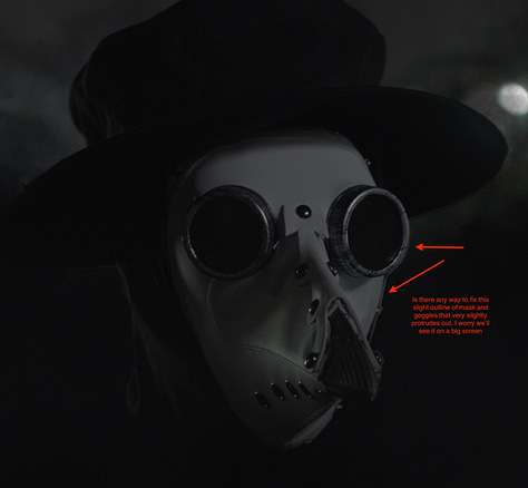
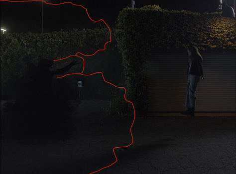

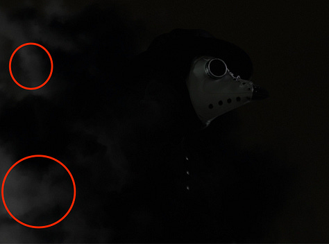
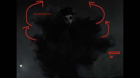


Supe, Highlander and I utilized a long email thread that eventually moved over to a WhatsApp thread where I would share all of my notes, feedback, motivational statements and memes to keep us all moving.
A lot of tracking the deadlines and launching the shots would typically occur on a bigger production by a VFX producer and other production personnel, but this was one where I had to stay on top of the deadlines and shots along with Supe to make sure that the project reached completion.
In hindsight, this mockup format of giving notes was very inefficient and eventually I transitioned over to giving the notes by recording my screen with a screen share video as I stepped through my notes with the editing timeline in front of me.
This proved to be way more enjoyable, clear and efficient and these are the types of videos I would give notes by to Highlander. I continue to do this format for giving notes to other department heads now such as my sound designer, composer, colorist, etc. I find it much clearer and elegant to communicate the points across.
As we made our way further into the VFX pipeline, I started to realize a few other effects I wanted to add in post, mainly to enhance the intensity of the film but also to really create it’s own distinctive aesthetic for the action and pack a bigger punch to the movement of the camera.
As I learned more about what could be possible with VFX, a lot of things ended up adding, that were never planned before, but I knew could elevate the film overall.
Things like a specific “Circular Warp”, post camera shakes, and a teleportation that ended up becoming my favorite effect in the whole film. For these additional effects, I researched further influences and provided to Highlander for the warp and other effects.
For the camera warp, I found a stock footage video of a circle that resembled a jet engine turbine, that moves so fast the colors blur together, creating a centrifuge of moving color around a central point.
For the post camera shake, I referenced the intense in-camera shakes they do in the Star Trek movies but also some sequences from Interstellar and First Man on board the ship scenes where they jerk the camera into tilts and shakes.
Notably, the “apparition” effects from Harry Potter were a big influence on the teleportation effect. Even down to the way they add a slight post camera shake, sound effect and fake dust particles in those films to enhance the impact and effect of when someone arrives. It was only then that I started to notice that it’s the small additional details that good VFX artists and filmmakers add in that seem invisible to the naked eye that really sell the effects and illusion on screen.
Finishing VFX
Over the course of about a year, due to the number of shots and notes given, and with one artist working on the entire film, I had finally approved every shot and we were able to successfully move into the sound design, score and color grade.
After every shot was approved, I had Highlander send me back a high resolution export of each shot at ProRes 4444 at 3.2K resolution since that was the native raw resolution we had shot the film at on the Arri Alexa Mini.
After I had the full resolution shots exported and sent back to me, I was able to plug those back into the editing timeline and then export an XML from Premiere to import into DaVinci Resolve, where our colorist Jensen Vinca color graded the film and I did the finishing touches. Afterward we exported out our final file from DaVinci, after our awesome composer and sound designer Sam Costello worked his magic.
Thankfully, when we got into the color grade, it truly enhanced and beautifully complimented Highlander’s VFX work and really brought out the deep blacks and the texture and living feel of the Doctor’s smoke aura.
It was certainly painstaking at times, but completely worth the effort and attention to detail at the end of the day and I could not be more proud of what we accomplished with this film and the scrappy VFX team of virtually 3 people.
In Conclusion
I truly believe directing this project allowed me the experience to be able to take on much larger projects of greater magnitude and post-complexity that I think will be essential moving forward. It also truly elevated my directing craft and taught me how to be extremely crystal clear and precise with every note, word and detail of every project you oversee as a director on any film.
Footnote
Here’s a link to the full storyboards PDF and a side by side shot sheet comparison below, to show how closely the completed film resembles the boards. It’s interesting to note how everything in the boards assumes the action moves on a left to screen right movement as I saw it in my head and in the actual film, everything moves on a screen right to left axis. No real compromise on the narrative but funny to see how slight things change from what’s in your head.
If you enjoyed this article or learned something from it, please let me know and leave a comment. I’d love to hear what you learned or if you have interest in any other topics that I could write about for a future article. Thanks for giving this a read and if you are so inclined, I’d be very grateful if you consider a paid subscription to support these articles or even a share or free subscription.


